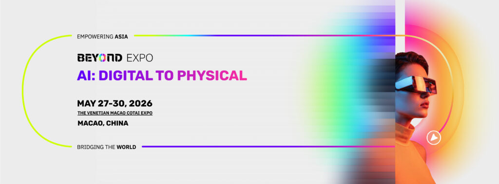
BEYOND Expo has officially introduced its new Visual Identity (VI) system, marking a significant step in its evolution as a global innovation hub. The upgrade also aligns with its 2026 theme, “AI: Digital to Physical,” reflecting the growing convergence between digital technologies and real-world applications.
As technology and entrepreneurship becomes increasingly interconnected, companies are no longer defined by geographic boundaries. A new generation of innovators—particularly across Asia—is building with a global mindset from day one, supported by strong supply chains, advanced digital capabilities, and a resilient entrepreneurial ecosystem.
Against this backdrop, BEYOND Expo’s refreshed brand identity reflects both its growth and its ambition to further strengthen its role in connecting innovation across regions.
A Refreshed Identity Reflecting Global Vision
Since its founding, BEYOND Expo has focused on showcasing Asia’s innovation to the world while facilitating cross-border collaboration. Over the years, it has grown from a technology exhibition into a platform that brings together startups, enterprises, investors, and industry leaders across multiple sectors.
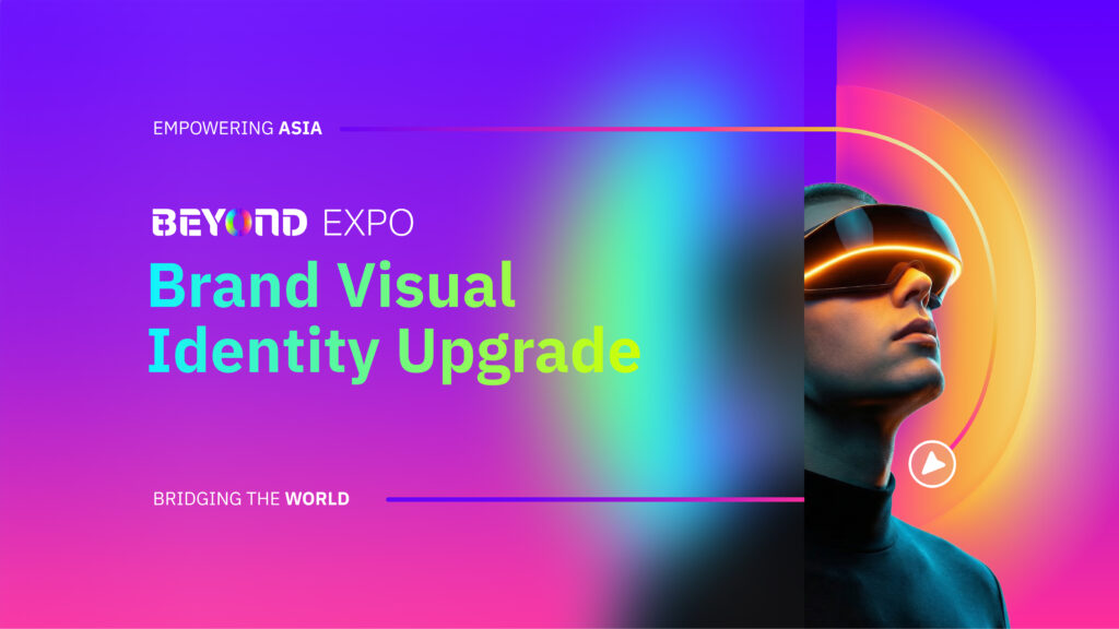
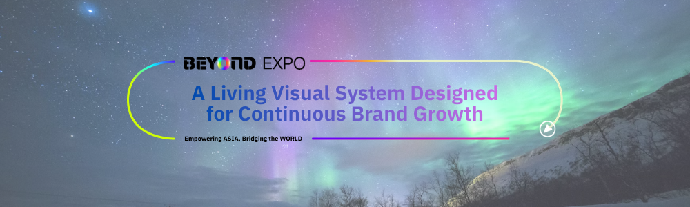
The new VI system retains the recognizability of the original logo while introducing a more contemporary and dynamic visual language. Designed for consistency across digital and physical environments, the update better reflects BEYOND Expo’s position in today’s global innovation ecosystem.
Inspired by the Aurora
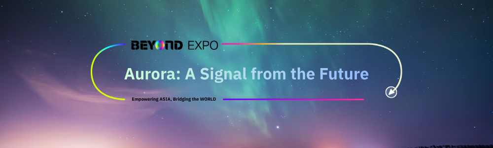
The new visual identity draw inspiration from the aurora, a natural phenomenon created by the interaction between cosmic energy and the Earth’s magnetic field. With its fluid forms and shifting colors, the aurora represents movement, energy, and convergence.
This concept aligns with BEYOND Expo’s role as a platform where technologies, industries, and ideas intersect, generating new opportunities for collaboration and growth.
The “Five Aurora Codes”: A Living System
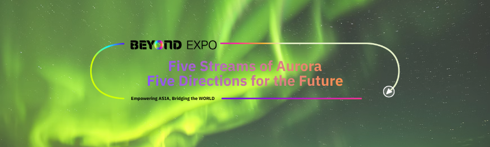
As part of the new VI system, BEYOND Expo introduces five core colors—referred to as the “Aurora Codes”—each representing a key thematic focus:
- Genesis Green: Sustainability and green technology, advancing a more responsible and resilient future.
- Fusion Cyan: The integration of digital and physical worlds, highlighting frontier technologies and the digital economy.
- Cosmos Violet: Life sciences and health technology, focused on exploration and human potential.
- Inspire Rose: Creativity, design, and cultural innovation, emphasizing human expression.
- Synergy Gold: Collaboration and value creation, underscoring partnerships across technology, capital, and industry.
Together, these elements form a flexible and scalable visual system that adapts seamlessly across formats and environments.
From Concept to Experience
The aurora-inspired design translates the idea of AI—from abstract digital intelligence into a tangible, physical experience. The updated “O” element within the logo acts as a unifying visual motif, extending from digital platforms to on-site installations and exhibition spaces.
This approach reinforces BEYOND Expo’s commitment to bridging technological innovation and real-world application.
Looking Ahead
With its updated brand identity, BEYOND Expo continues to strengthen its position as a global platform for innovation, collaboration, and business exchange. By bringing together stakeholders across industries, it aims to accelerate the journey from ideas to implementation.
Let innovation go beyond boundaries. Let connection create value.
Scan the QR code or Click the link below to join us!